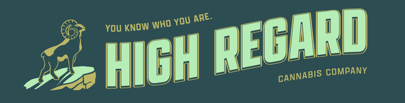
HIGH REGARD
CANNABIS CO.
Branding, packaging concept & style guide
The initial concepts were for the client pitch. First, we created mood boards, name options, and mini manifestos for each mood board. The client chose 3 distinct directions and 5 names (out of a dozen) that the brand could go with. Then I quickly designed and mocked up what these brands could look like. While working at Sandoval Agency, we won the pitch, acquiring the business thanks to the team’s effort.
It was quite the rollercoaster ride trying to understand more about WHO the company is, WHY they do what they do, and WHAT they stand for. But the urgent client just wanted a logo for their cannabis product company. I didn’t have direct contact with the client nor did I have the liberty to craft the brand spirit how I would’ve liked to be leading the client into understanding the importance of addressing (together) these core questions.
WHO (USER) Stoic 25-35yr olds who appreciate bold simplicity and don’t care for all the smoke and mirrors.
SYMBOL Based on one of the initial mood boards we called “Bullseye“. I made it in 2 seconds for the pitch and it always ended up back on the table after exploring alternatives to such the ever-ambiguous “High Regard“. The icon itself is simple, focused, elegant, and sturdy. It doesn’t call attention to self while still serving its purpose.
COLORS Black, charcoal gray, and white with splashes of mint.
TYPEFACES Moret and Obviously
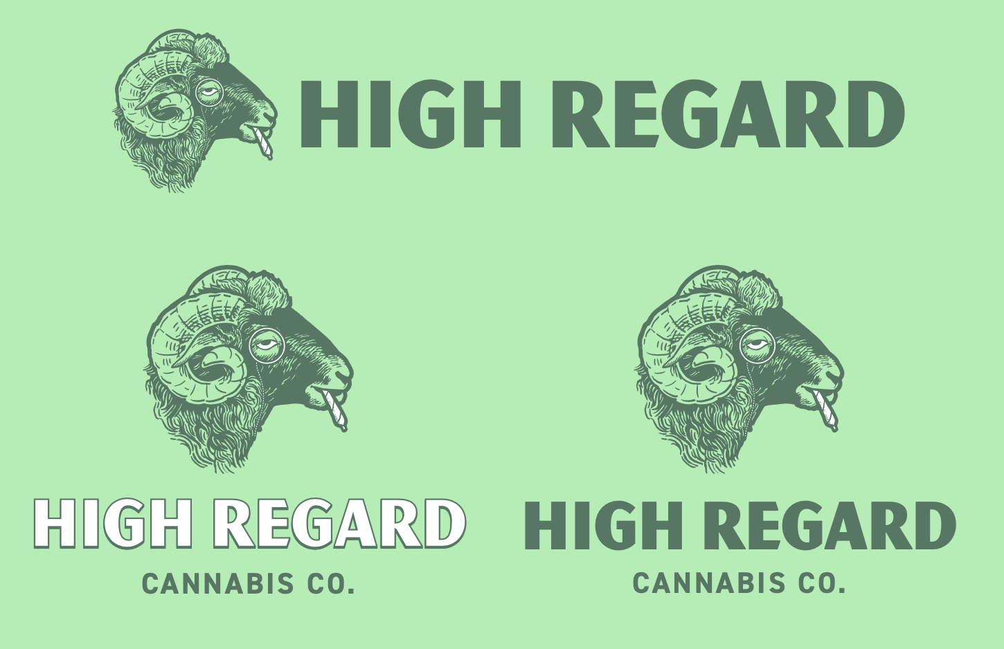
Below are three brand mocked-up designs from the initial pitch. Meant to showcase our creativity and expertise.


Bullseye mood board
A few discarded ideas. RIP